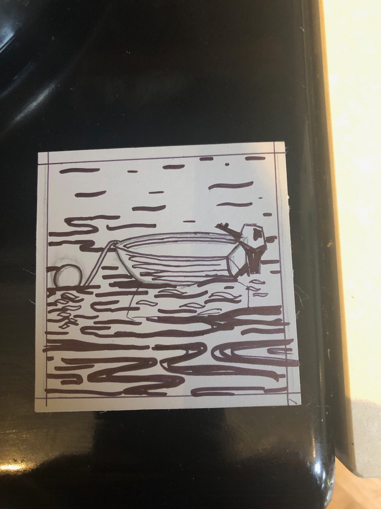
Making final work today for the Am Birlinn Christmas Craft Fair by printing a small boat linocut. I hope it will be dry by Friday!
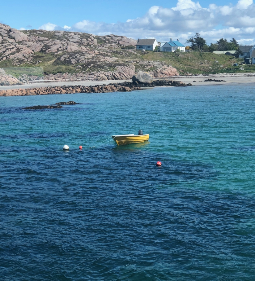
The inspiration came from a summertime daytrip to Iona earlier this year. There was an eyecatching bright yellow boat moored on the Mull side of the Iona sound which I thought would look great as a colour print. I had intended to make this for the current exhibition at An Tobar ‘Yellow’, but I just didn’t manage to.
I decided to opt for making a reduction linocut rather than a screenprint as I wanted to develop my skills. Colour linocuts are something I often shy away from and I must try to go beyond my comfort zone.
Beautiful Yellow boat
Sketch for the print
Design drawn onto the block
Final print
The trouble with the yellow boat and reduction linocut was that really the yellow wouldn’t work with the process. Generally you work from pale to dark colours, but if I printed yellow all over the block the blues would turn out quite murky and not very vibrant. I could have cut a separate block for the yellow but I was concerned that the registration would be off. I opted to make a stencil for the yellow, where I inked the approximate area of the boat and its reflection only, on the block after I had made the first (white) cuts, and then used a paper stencil to keep the edges neat. The next stage was a blend for the sea background and a dark blue final layer. I had planned an intermediate colour layer but I decided to change this plan as I could see the print was going to lose definition when I did the first proof of the mid tone.
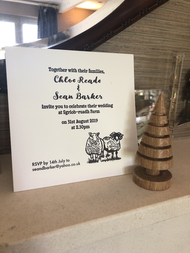
My eldest niece is getting married later this summer. I was asked to make her wedding invitations a few months back and was very chuffed to be asked. Chloe wanted something that was special and personal for her and her fiance, Sean. At first Chloe asked me for a what sounded like a simple print on a card, and I was imagining doing a small linocut or screenprint, but things are never as straightforward as they at first seem!
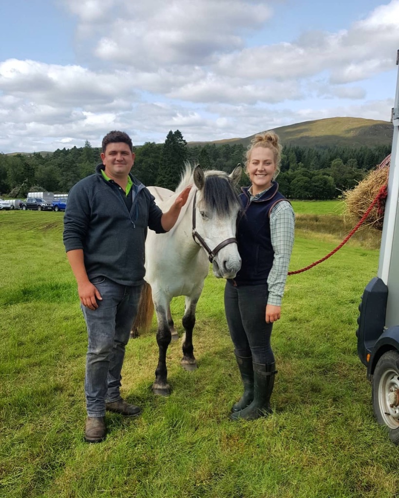
She and Sean are farmers and animal lovers to the core. They work with sheep and have 4 working Border Collies as well as 3 pet dogs, one of whom has amibitions of a working life too. So when the brief began to emerge, of a design comprising both Chloe and her fiancé Sean, some sheep, and all seven dogs I soon realized that a single linocut print with all of these elements would not be feasible within the confines of a postable invitation size!
Chloe supplied me with endless photos of her dogs, sheep and of herself and Sean. The nicest portrait of the two of them was with a white horse, which then became part of the gang as well. I began sketching the dogs and preparing to make them into linocuts. For each dog I printed a small edition on 5” x 7” paper in black ink. It was lovely to work through all of the dogs and I could see each of their personalities even just from photos. I have met some, but not all, of the dogs which helped a bit, but now they have moved to a different part of Scotland I was confined to working from photos only.
My method was to print a linocut of each dog, two sheep and Chloe, Sean and the pony, then scan the image and then reduce it so I could make a composition of all the animals and people to fit on the 7” square cards I had bought to print onto. I planned to print these on my digital printer.
As well as the images, I worked on the wording and typeface of the invitations which would be on the inside of the cards. Typically, but without knowing, Chloe chose the version in a typeface called ‘Farmer’! It obviously appeals to the farming market!
Once I had arrived at the arrangement that seemed to be the best balanced, and Chloe was happy, I printed a few test cards. They were nice, but I was a little underwhelmed with the result after all the work that I had put into drawing, carving and printing all the linocuts. The digital print was not as nice as the hand made prints. The black wasn’t quite black enough. They looked quite flat.
I was probably being too critical. Chloe would probably have been happy with them as they were. But these were important invitations to be sent out to the whole family and lots of friends. They also represent my work. I wanted them to be the best they could be.
I knew letterpress printing could transform the look. The debossed prints can be so lovely with such a tactile finish. After a little bit of googling for letterpress printers I made an enquiry with Cotton Letterpress who came back very quickly and enthusiastically. Their work looked good from the pictures on their website and the video of the printing process. I was sold! I knew this would be the way to make the most of the work I’d done and give Chloe & Sean some invitations they could be really proud of. Soon we had finalized the optimum size and agreed a price to print the final number of cards, printed on 2 sides. We just had to wait while they were printed and posted out to us.
On the mantlepieceLook at that gorgeous texture!Pride of place
I am really delighted with them, and I hope Chloe, Sean and their guests will be too. Now I just need to find something to wear for the big day!
…
I can be commissioned to create invitations for your event. Get in touch to discuss your requirements.
There are a small number of limited edition doggie linocuts available to purchase at Calgary Arts and The Glass Barn at Isle of Mull Cheese. You can get a lovely lunch in both places.
When Denise Baxter got in touch to say she was launching a new recruitment consultancy business and needed a logo I was very happy to help. As is often the case with Denise, the time frame to make things happen was short. Denise is a bit of a dynamo, and she has rigorous standards. So while I was delighted to have the opportunity, I knew it would be a tough gig!
Denise wanted to make a complete change with her new company and gave me carte blanche to design a logo for her. Previously, she had a very safe corporate colour palette of blue and grey. I knew this didn’t really reflect Denise’s style, because although she is always the consummate professional, she is also a very lively person with a big heart and a wicked sense of humour. I knew she and her new business could rock a bolder look that would be different to the other brands in the market place, without looking totally out of place.
I knew that one of Denise’s favourite colours was raspberry pink. As she was the main asset of the company I wanted the branding to reflect something of her, so I knew I would build it around this colour. This wasn’t a colour that similar enterprises use, so it was a bonus. I teamed this pink with complementary greens and harmonising tones of the same pink.
The main function of the company is to search for candidates to fit job roles. Every potential candidate has a range of skills, strengths and weaknesses, and the perfect person for the job will have a sweet spot where they have a set of skills which align with what the employer is searching for. The Venn diagram seems to graphically represent this perfectly. Of all the ideas I pitched to Denise, this was the idea that resonated most with her.
There are little dots between the letters of the word IDENTIFY representing a pool of candidates. Most of them are pink with the one between the I and D being green – the perfect candidate who is identified and gets the green light for the job!
In record time, two formats of the new logo were approved and finalised, and put straight into use by Identify HR & Resourcing Solutions Ltd.
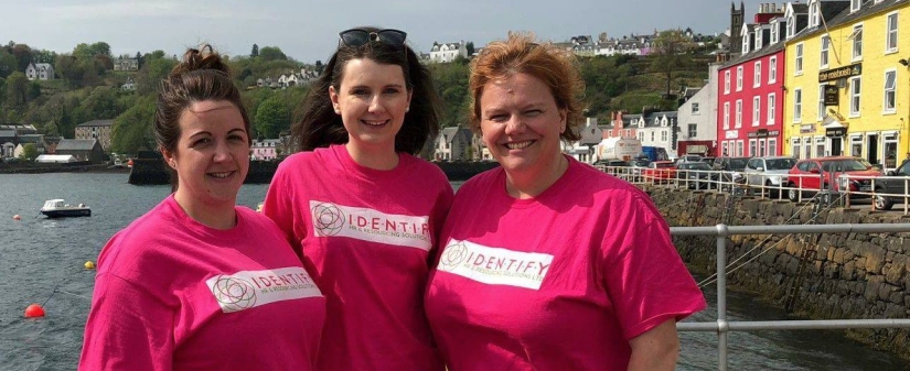
Denise and her team wasted no time in applying the logo to their new T-shirts!
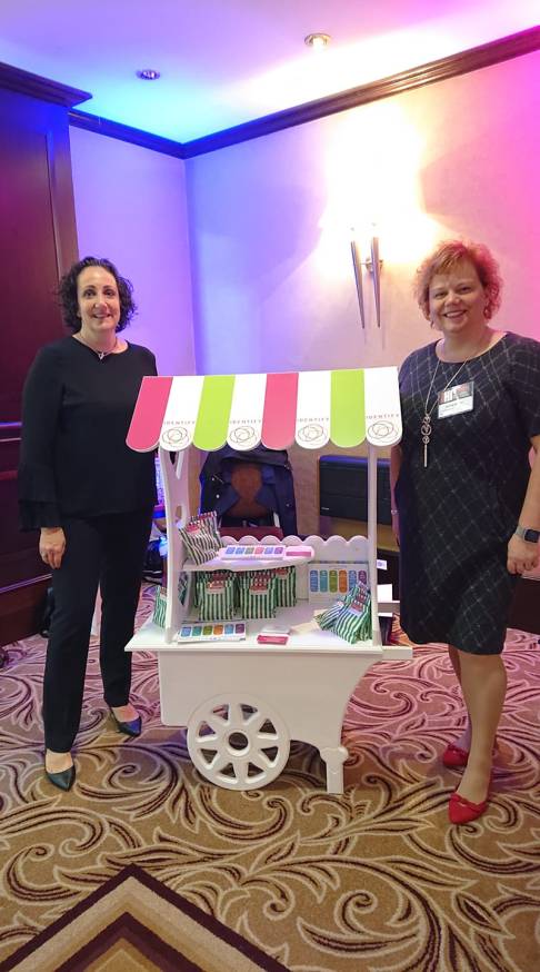
Soon Identify had me designing business cards, flyers and some graphics for the new website. Recently, Denise even had a branded sweetie trolley at a trade conference, for which I designed the canopy. The trolley was filled with Pick & Mix sweetie bags in company colours and sealed with little branded stickers that promote their innovative new Pick & Mix recruitment services.
Denise is delighted with her new look and I wish her and her team every success.
You can check out Identify here
Read Denise’s testimonial here
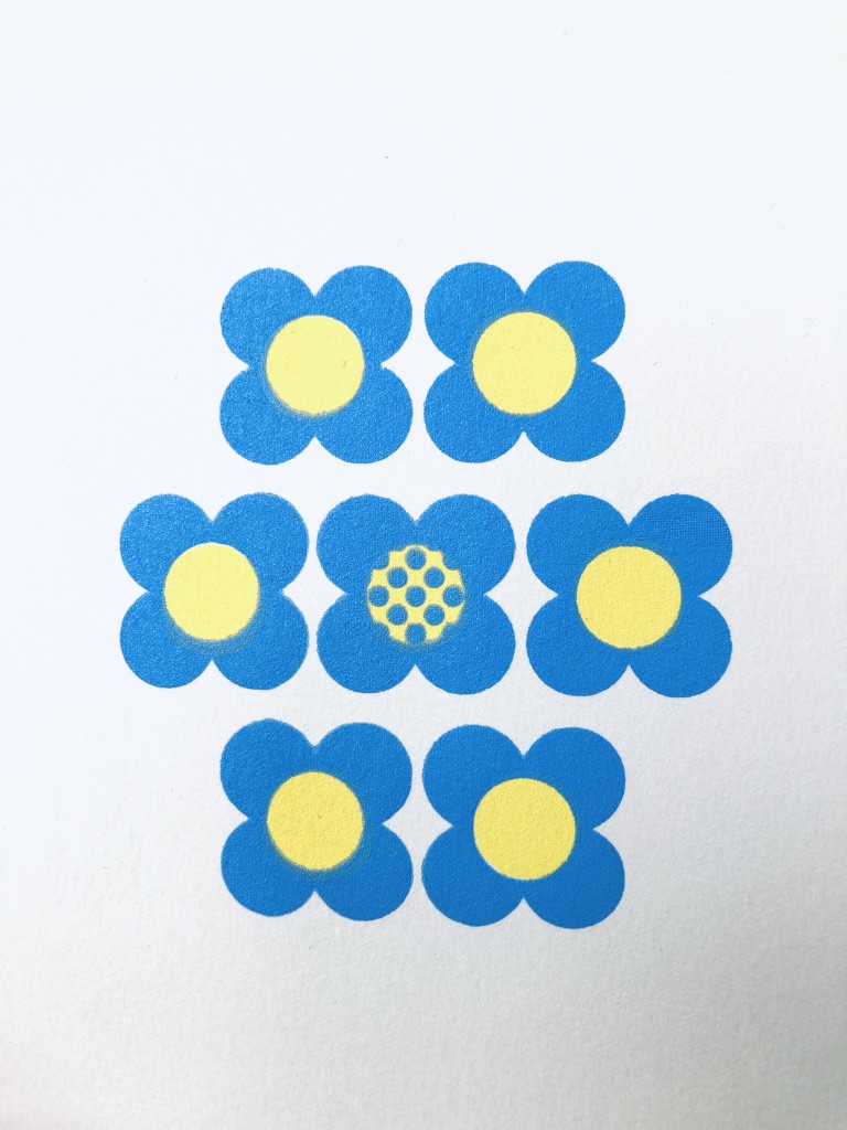
I have been enjoying developing the theme of the simple floral screenprints I began to explore a few weeks (or is it months?) ago. The flower shapes are inspired by Orla Kiely’s graphic patterns which I have always loved. Yesterday I printed 4 new varieties, in my favourite colours of duck egg blue, orange and a taupe shade, which I had mixed for a previous print of Three Flowers, one in each colour. Three of the new prints entitled Quartet were based on a group of four flower motifs. I built up from one to three colours, adding different coloured circles to the centres of the flowers. There is a series of 3 prints each in a small edition of only 6, so truly limited editions.
These prints will be available for sale soon at both An Tobar arts centre in Tobermory and at Calgary Arts near the beautiful Calgary Beach. You can get great coffee and lunches/baking in both places, so well worth a trip out. I’ve also kept just a few here and have listed them on my online shop where you can order one to be delivered to you at any UK address.
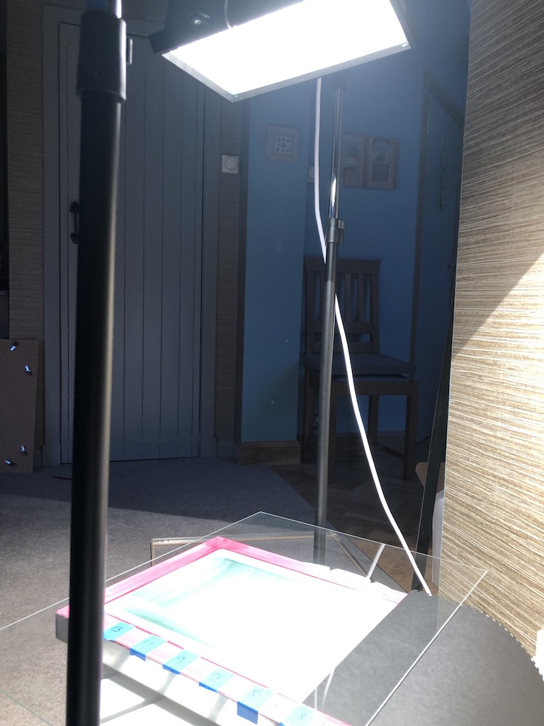
I’ve spent a few days grappling with various pieces of equipment in an endeavour to work out a system for making screenprints at home. Previously, the screenprints I’ve done have been made at Edinburgh Printmakers. Their old studio has now closed and they are getting ready to open in new premises at Castle Mills soon. I hope to be able to join again and spend a bit of time making bigger pieces there when I can find the time. But Edinburgh is many miles away from Mull and it is nice to be able to make prints without the travel and time pressures.
At Christmas, I was given two screens by my husband, together with drawing fluid and screen filler. I tried to make a print with that, but I was disappointed with the results, and I knew I had to find a way to use photo emulsion and to be able to expose my own screens. I found an excellent little exposure unit online. It’s basically a clothes rail and a very bright light! A 1000W bulb. It certainly brightens up the room when it is on.
Last weekend I coated my screens with the emulsion and ran a step test to find out how long an exposure was needed. Then I set to work on a design to try it out. The designs exposed and washed out really well and I was delighted. Until… I spotted a typo on one of the screens! Then my printer ran out of black ink so I couldn’t print another transparency, so it was all very frustrating. Luckily, I had also printed a simple little Orla Kiely inspired floral design on part of the transparency so I cleaned off the incorrectly spelled words and repeated the process with the flowers.
Today, I set to with printing. I did two different one colour versions in purple and a sky blue, and then added yellow centres to some of them to make a 2 colour variety.
I’ve learned a few things along the way, and I’ve really enjoyed the whole process, even when there were setbacks.
Hopefully my new ink for the printer will arrive soon and I can make some more!


 Chloe supplied me with endless photos of her dogs, sheep and of herself and Sean. The nicest portrait of the two of them was with a white horse, which then became part of the gang as well. I began sketching the dogs and preparing to make them into linocuts. For each dog I printed a small edition on 5” x 7” paper in black ink. It was lovely to work through all of the dogs and I could see each of their personalities even just from photos. I have met some, but not all, of the dogs which helped a bit, but now they have moved to a different part of Scotland I was confined to working from photos only.